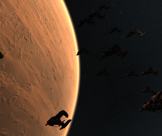
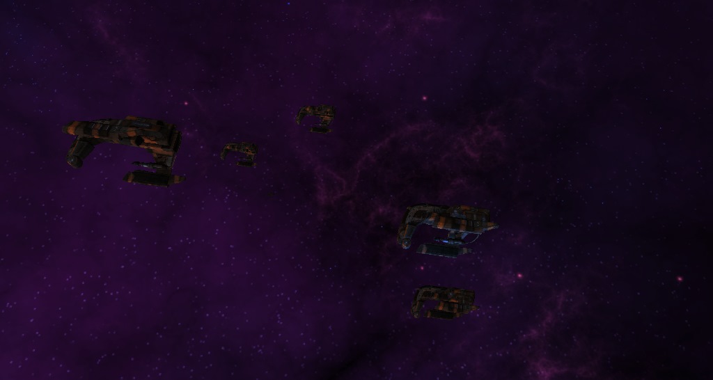
Not much to see from me in the past months… My lazyness even surprised myself.
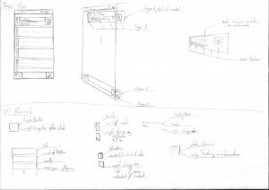
Anyways, here are some sketches i made a few weeks ago. I won’t explain them, but if you have questions feel free to leave a comment.
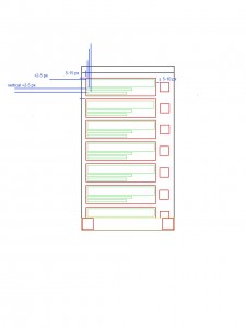
The following image is just the first menu as digital layout with UI elements and some metrics. Red rectangles are touch areas / buttons and green rectangles are just dynamic rectangles that show some info. The yellow rectangle is a simple overlay.
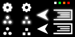
Switcher will use a single image as texture for almost every element. This allows the user to modify it in any way. Here is the first final version.
More info soon 😀
